This week I’m deep into projects and real estate so I’m going to put up some ideas that I’ve been working on with various clients. We’ve got a boy and girl sharing a bedroom, some living rooms and some mantle ideas. Many of them have been tweaked and changed to fit their needs or are still in progress, but if they give you inspiration in any way, then hooray!
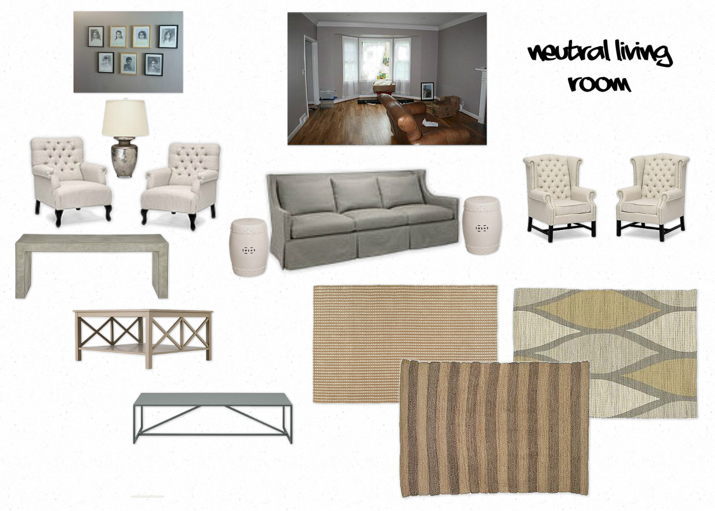
Another project, the family started with a virtually empty formal living room. They renovated their bungalow, popped the top, added a family room and so the living room became a dead space. The idea was to go fairly neutral and keep the wall color, so we blew up a black-and-white drawing done by one of their children and put it over the mantle. The other focal point was a collection of seven fantastic black-and-white sketches of each child. Yes, I said seven children! With these things taking stage in the room, the rest of the room suggestions were fairly neutral. The sofa they purchased ended up being a very light pattern from Lee Industries called “Botswana Gray,” a subtle nod toward zebra, but not really. The Lee furniture is slip-covered and will be great for a family with lots of kids. We chose a durable sisal rug with a black border, and these two chair options would both be great to add a more formal sitting room feel around the fireplace.
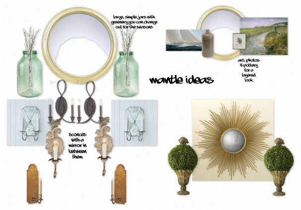
Sometimes a simple mantle makeover can really change up your living room space. I love the idea of containers for greenery and “twiggy” items that can be changed up for the seasons. Sticks of red berries for the holidays, willows in the winter, and long branches with little buds for Spring in large glass jars or jugs, or similar containers with character, flanking a mirror.
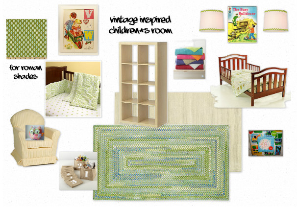
How do you style a bedroom for a toddler little boy who loves construction equipment AND a baby girl on the way? The first look is vintage inspired, and the second, modern. I love Garnet Hill linens for both! In both rooms I am suggesting a fantastic staple, a reversible quilt that comes in a handful of vibrant colors perfect for children. You can pair these with dainty sheets for a more feminine, refined look or with bold stripes or construction equipment for your toddler who is in love with bulldozers! 🙂 I found a Busy Bulldozer book on ebay and am suggesting they frame pictures out of the story over their toddler’s bed. The vintage poster was also an ebay find and is more feminine. The other challenge is to create a special space for the toddler so that he can have his own space. Once again, IKEA comes through with it’s shelving which can be turned on its side to create a partition in the bedroom and also house his books & toys. Wall sconces over the bed will be perfect for snuggling up to read a bedtime story and a plush rug covering the majority of the room is a must.
Fabric is Moda in Vintage Pear, crib sheet, bumper & numbered bins are Land of Nod, Rugs are Capel, lamp shades are Shades of Light. Vintage owl pillow is from etsy.
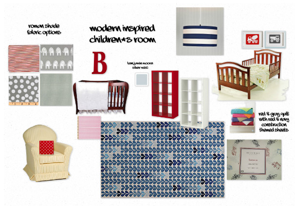
This second look for the same room is a modern approach. The same dark brown furniture and rocker are already in place in the room and once again, I love those coverlet quilts. This time I would use the red/gray instead of turquoise/lime quilt, some construction sheets and modern prints from etsy and a red or white bookshelf turned in it’s side as a room divider. The fabric options about here as the room is more neutral but moving toward ticking stripes or polka dots for the little girl’s side will add a sweet and feminine feel. The bold, graphic rug is the focal point but the hearts keep it from being too boyish. A pendant light over the bed will work as a reading light when the baby’s side of the room needs to be dark.
*Rug is Capel, drum light is from Shades of Light.
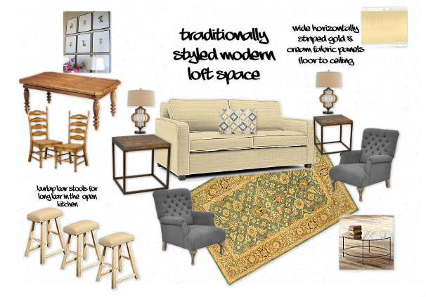
This project is a modern style loft that we are decorating with a more transitional style (between modern and traditional). The ceilings are 15 feet high and the curtain panels will be fat horizontal cream & gold stripes or tan & cream stripes (we are undecided) on either side of a tall window. A large collection of framed botanicals would make an impact over the dining table area, especially with the high ceiling. These rooms are open to the kitchen where three rustic stools with burlap cushions or three of these may be seating at the bar.
*Rug is from Safavieh, coffee table & sofa are from West Elm, lamps are Regina Andrew.
Sometimes I can’t believe how much fun it is to get to do this stuff for people as a job! Most of all I just love it when clients get HAPPY about their space again once it has been restyled, staged or simplified.
-HP

